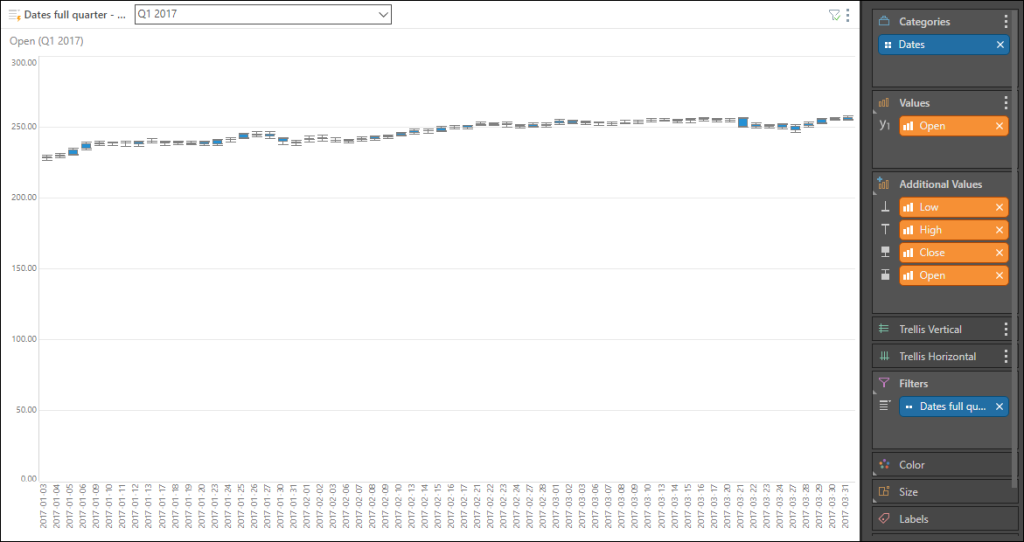
The box and whisker chart is a method of plotting groups of data through their quartiles. The values of the upper and lower quartiles are displayed in the box, while the whiskers represent variability outside these quartiles.
The box and whisker chart requires the following four values: Upper Quartile, Lower Quartile, High, and Low. To build a box and whisker chart, you must have measures that represent these four values; .
Build a Box and Whisker Chart
Step 1
To easily generate the values for the box and whisker chart, add a measure to the Values drop zone.
Step 2
Next, go to the Query ribbon, and click the Statistics drop down button. Under Quartile Statistics, select your given measure. This will automatically generate the required quartile values and populate the chart.
Step 3
Start by adding the relevant time dimension to the Categories zone. Add the Open measure to the Values zone, and to the Additional Values zone under Upper Quartile. Add the Close measure as the Lower Quartile, and then add the High and Low measures.

Note: you can also download the stocks data Python packages in Model. Click here for details.